Assignment 2
Plotting Data in R
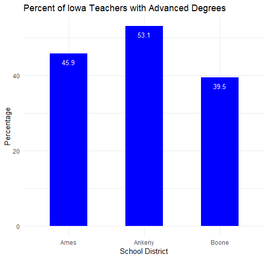
Using data sourced from the Iowa Department of Education, I first downloaded salary and demographic data on Iowa teachers. I cleaned up the file in Excel before bringing it into R, isolating the data from Ames, Ankeny, and Boone school districts. Using a pipe function, I calculated a field representing the percent of teachers with advanced degrees in each district. I plotted the resulting data on a bar chart using the “ggplot” function, with labels showing the exact value.
Mapping Data in R
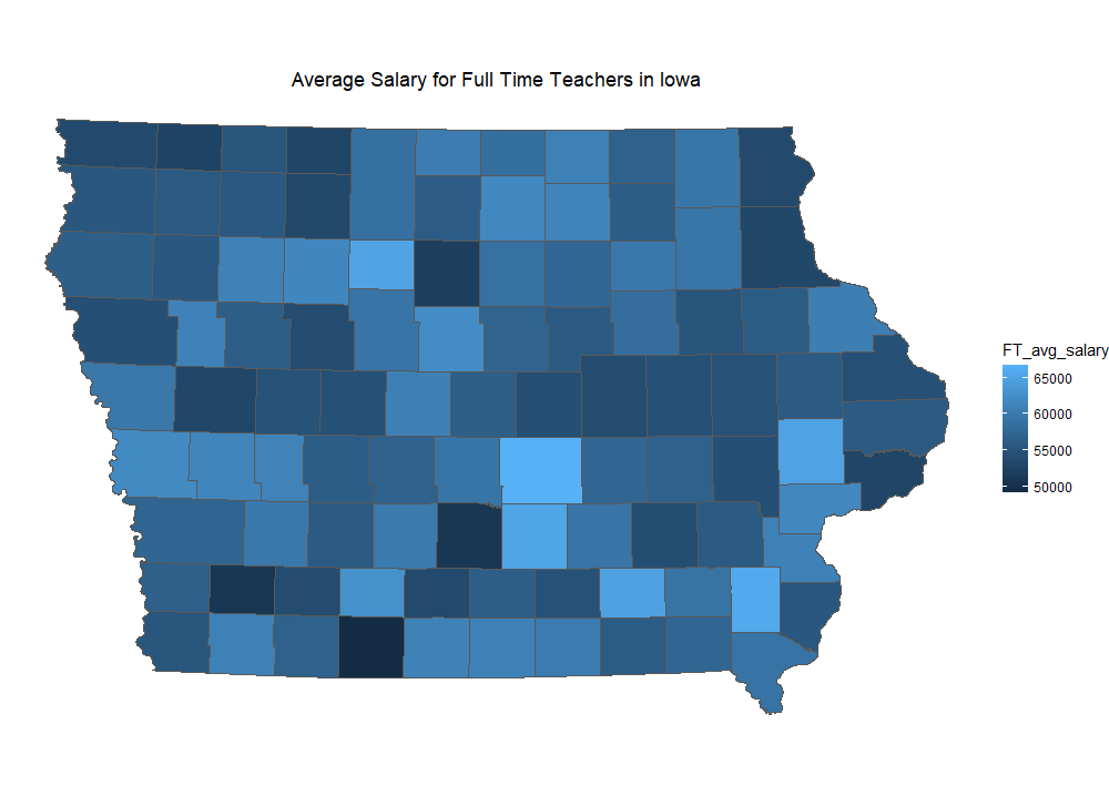
This map was created using the same initial data set as the plot above. Here, I grouped the data by county and summarized various fields using a pipe. I then joined the data table to a shapefile of Iowa counties after renaming the fields to match. I chose to map the average salary of full time teachers by county, which was calculated in the pipe by taking the sum of the average salary per district divided by the number of districts in each county.