Process for Final Project
Data Collection & Cleaning
When begininng this project, I knew I would need multiple data sources to get information on all the different topics I wanted to cover. I started just by compiling a folder of raw excel files and pdfs downloaded from my various sources.
I then went through and cleaned the data in excel, deleting any unnecessary columns. I also had to create a few excel files by hand when working with information that was only able to be downloaded in pdf form. I then converted all the excel files to csvs.

Below is an updated list of sources:
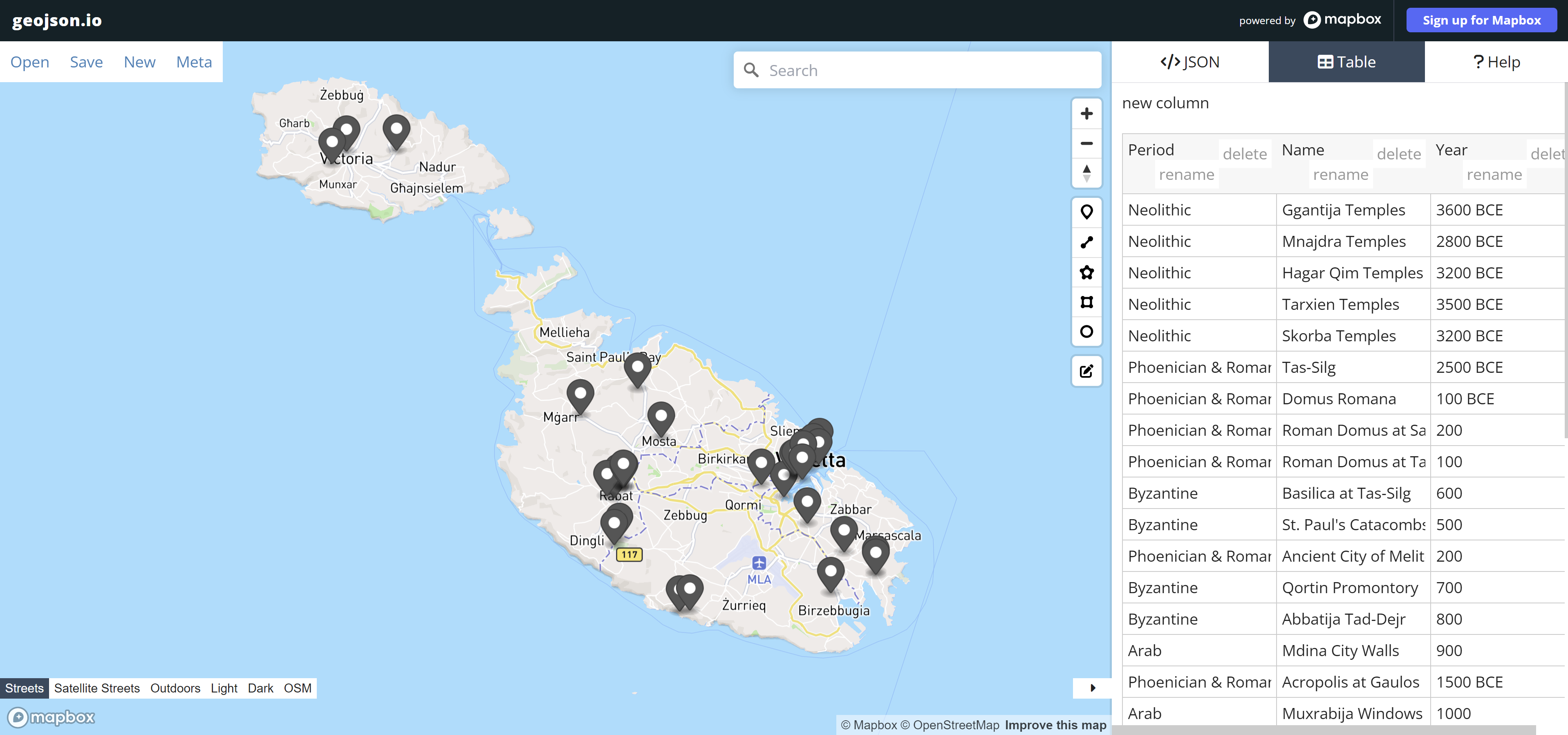
GEOJSON Shapefile Creation
For a couple of the maps I wanted to create, I needed custom shapefiles so I made them using geojson.io. I referenced my studio’s Historic Structures Report and various maps made by my classmates, as well as Google Earth to determine the historic building locations, foreign embassies, and ports.
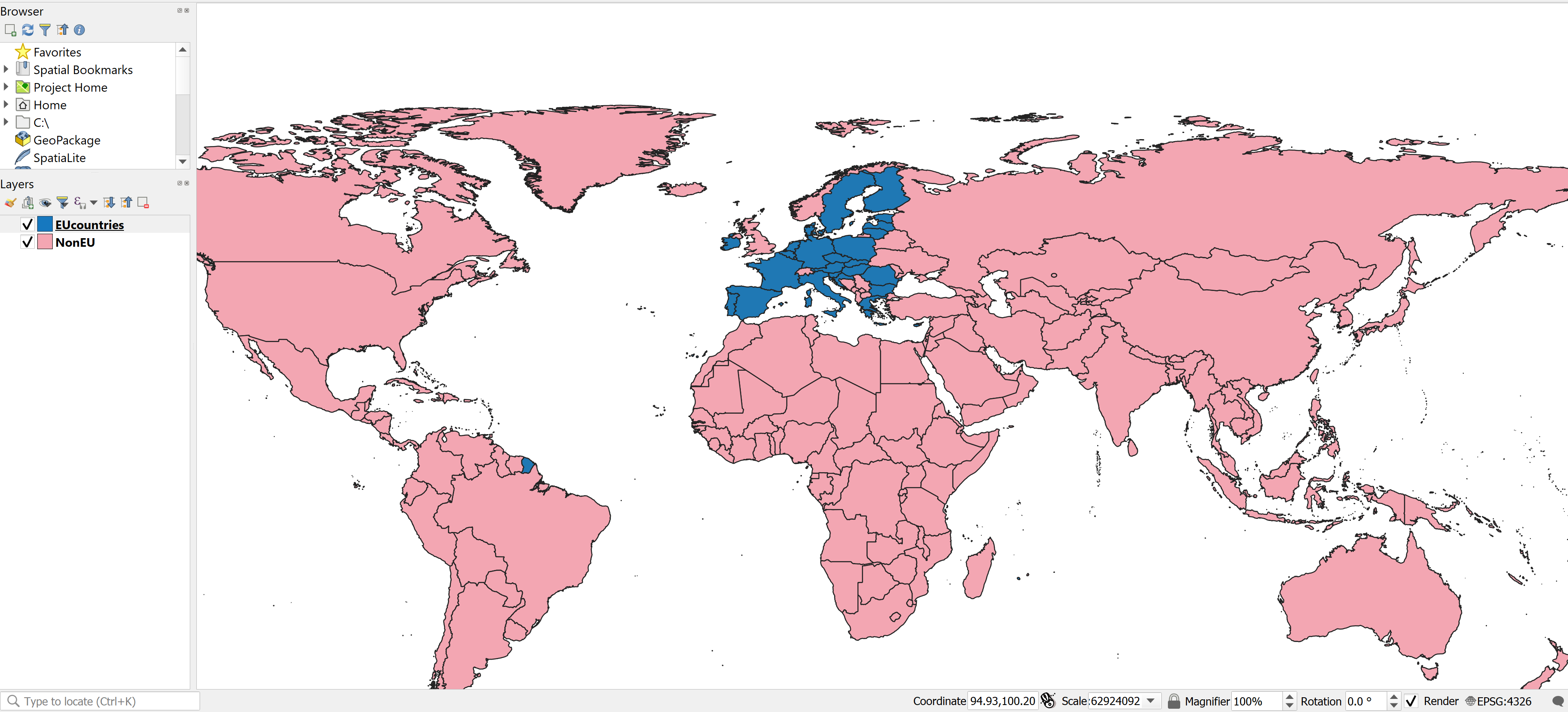
QGIS Shapefile Cleaning
A couple of the other shapefiles I needed I was able to find online; however, they needed some major cleaning to be usable for my project. I opened the shapefiles in QGIS to delete unnecessary fields and columns, then export out a new shapefile.
Photoshop Add-ons
In addition to the Tableau graphics, I chose to make a few png graphics using Adobe Photoshop.
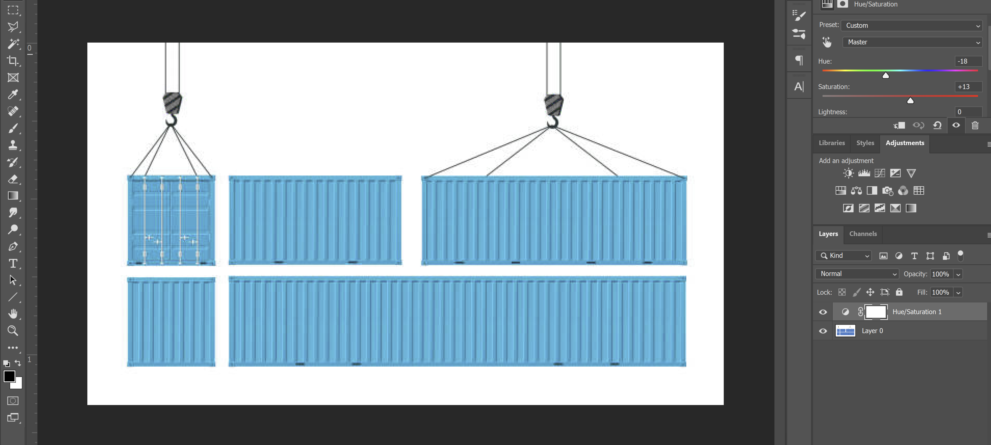
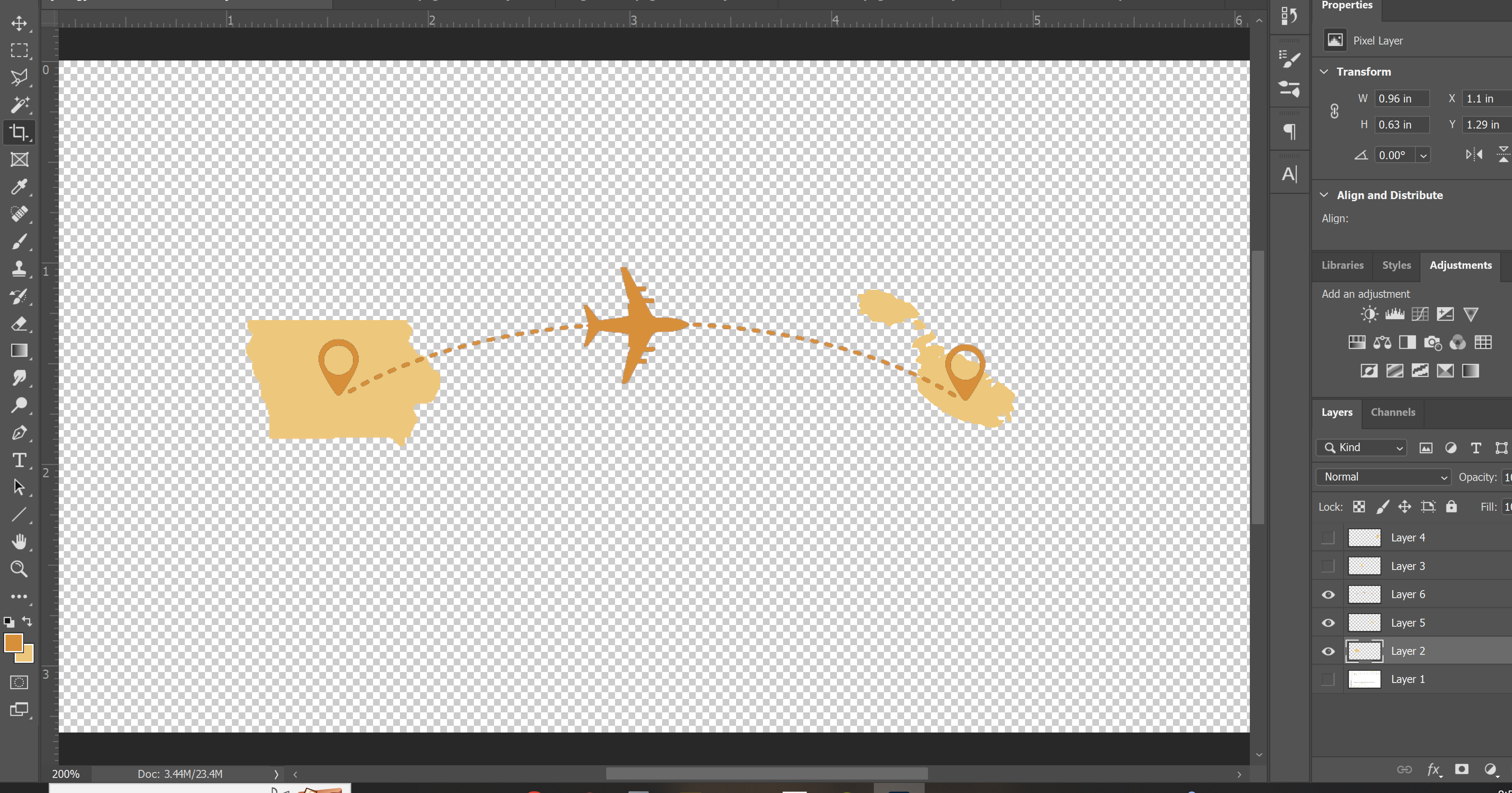
Tableau Process
When starting in Tableau, I had multiple shapefiles and csvs that had to be brought in as seperate data sources. I had to go back a few times and tweak the data csvs and relink tables as I ran into errors.
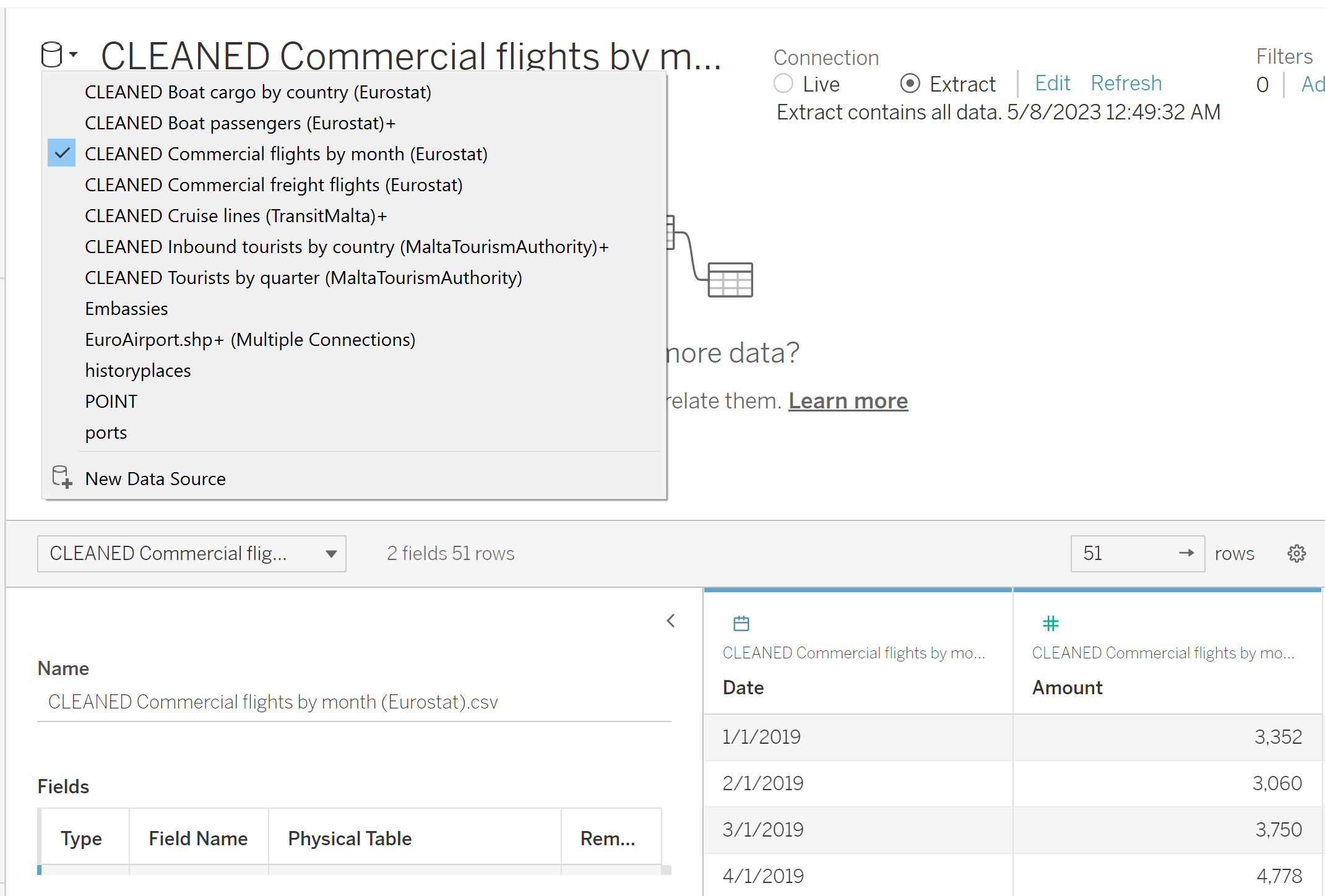
I decided I ultimately wanted to have a story with 5 dashboards: history, shipping, aviation, tourism, and diplomatic relations. I created all the sheets seperately before assembling the dashboards.
Tableau Dynamic Image & Text
For the history dashboard, I wanted to have an option to select a period of occupation and have a text description of that period update. I looked up how to create a dynamic text sheet and followed the tutorial HERE using the first method.
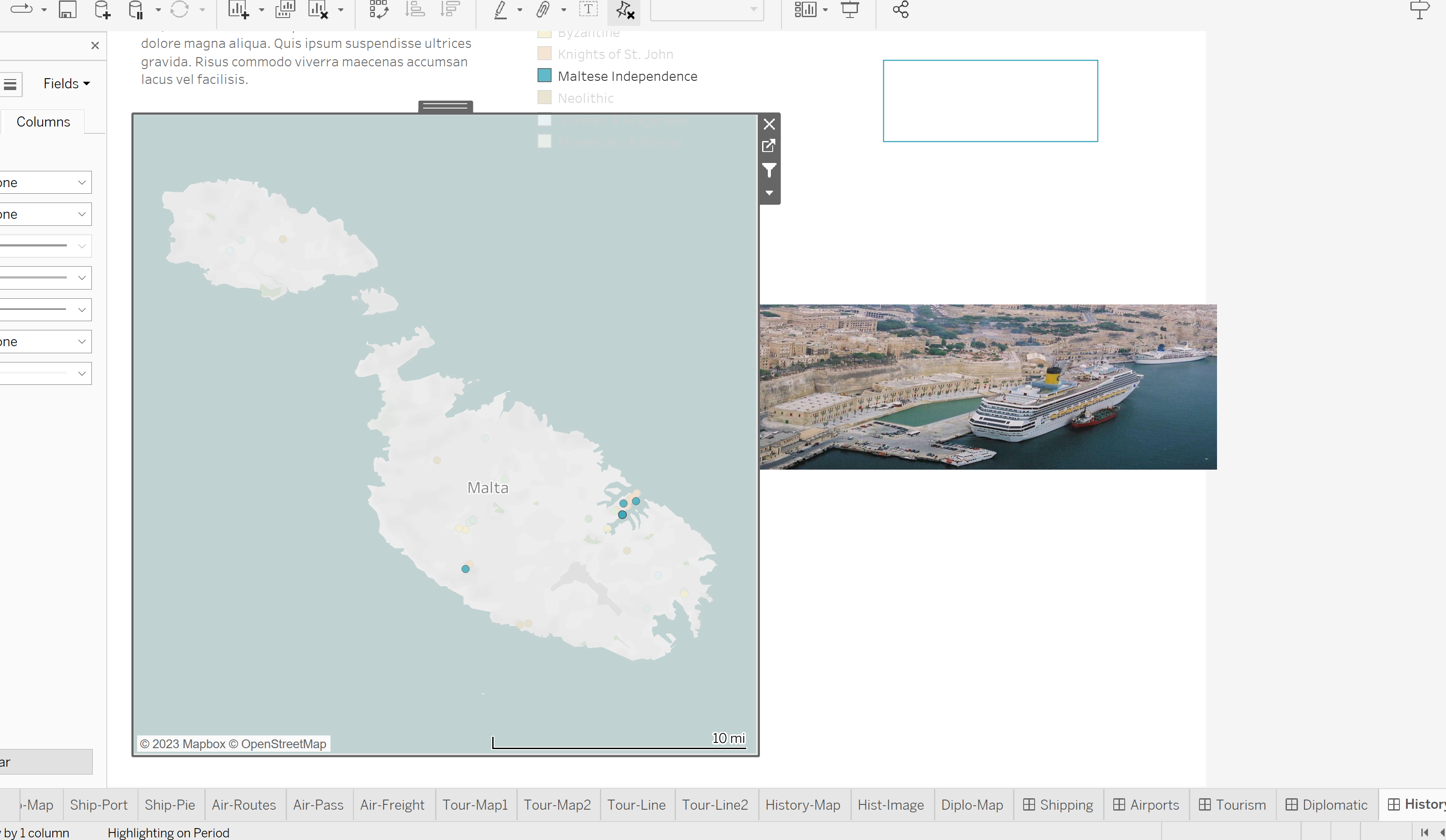
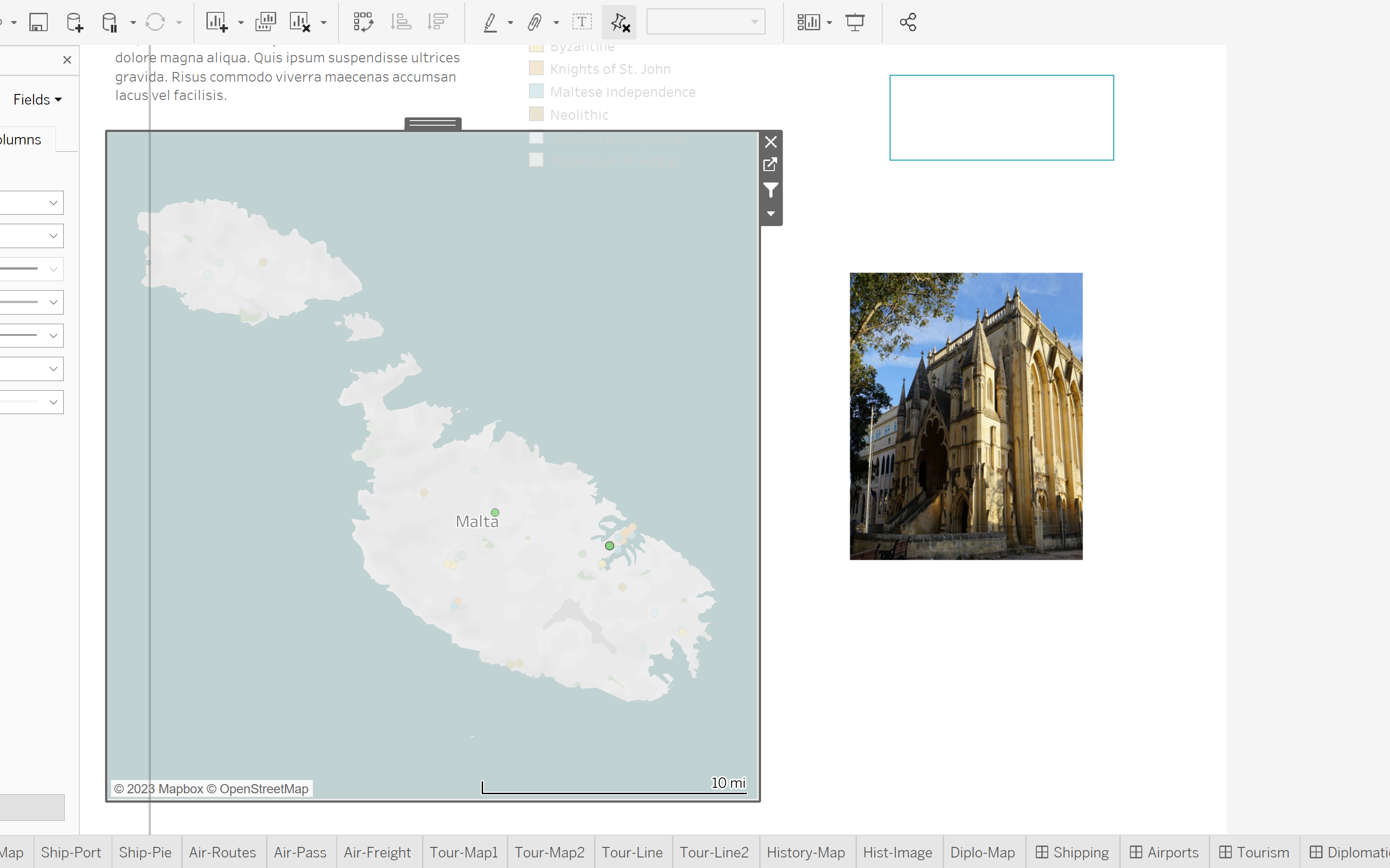
On that same dashboard, I also wanted users to be able to click on a historic site on the map and see an image of the site. Again I googled how to do this and followed along with this tutorial HERE
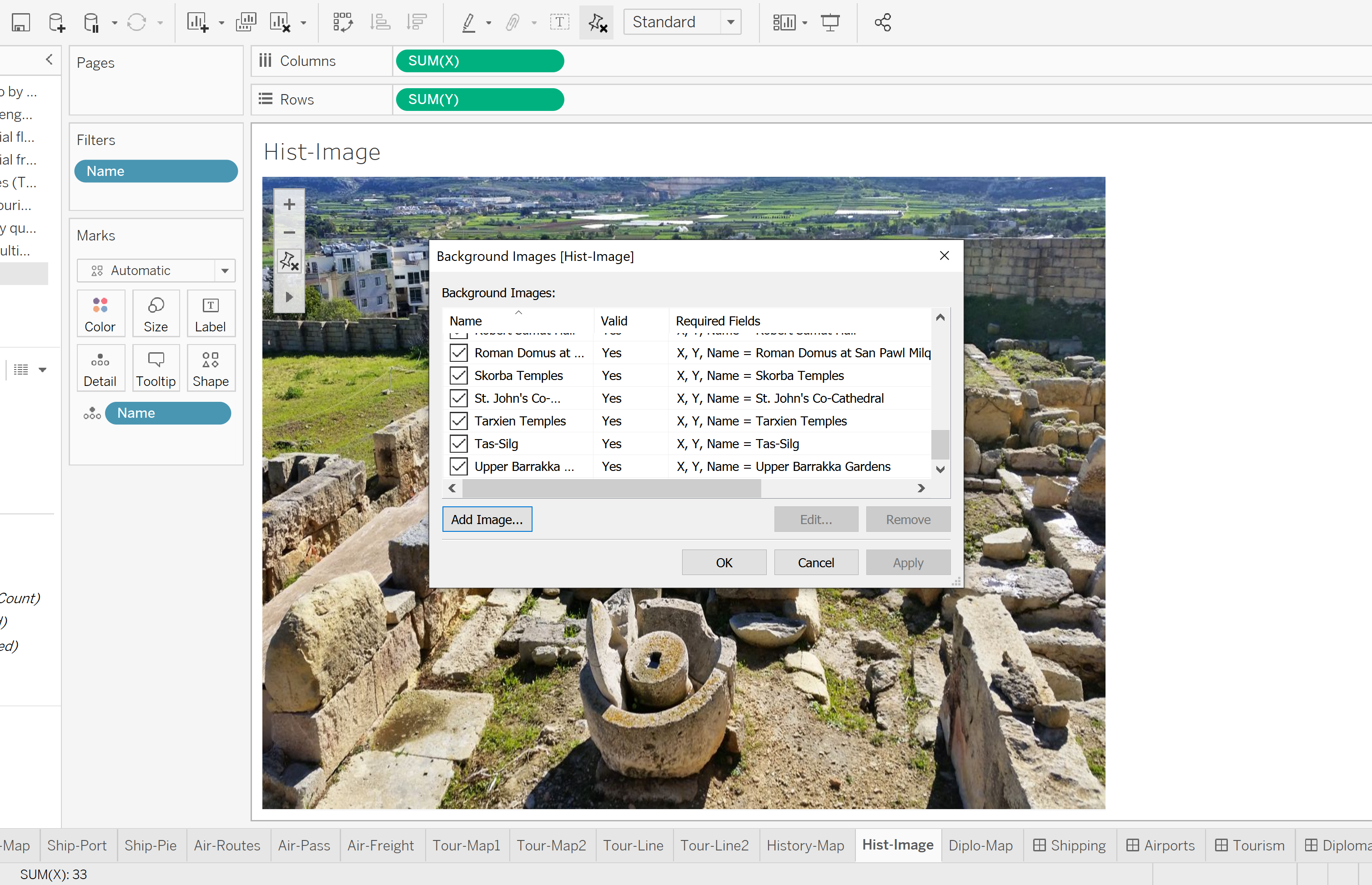
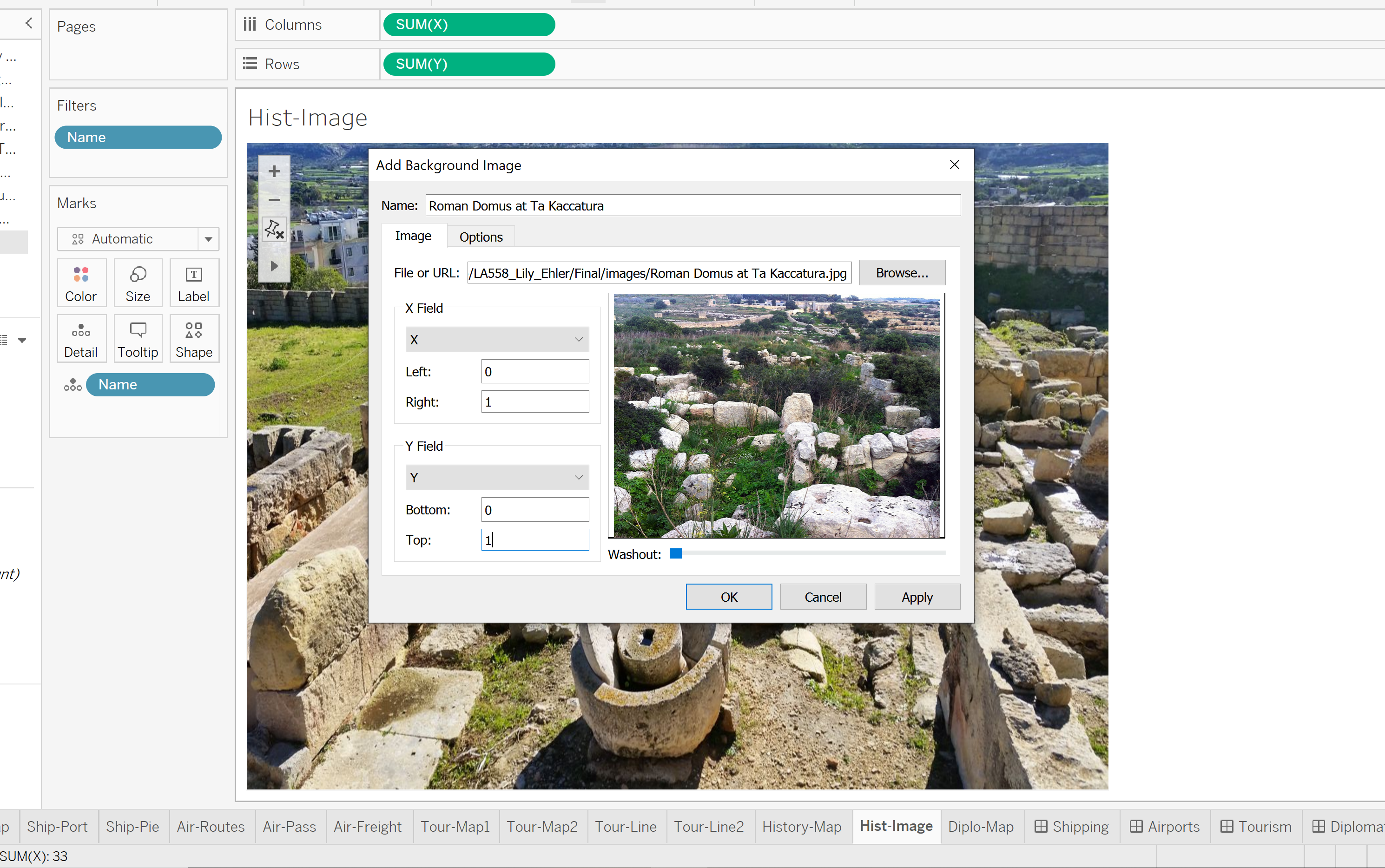
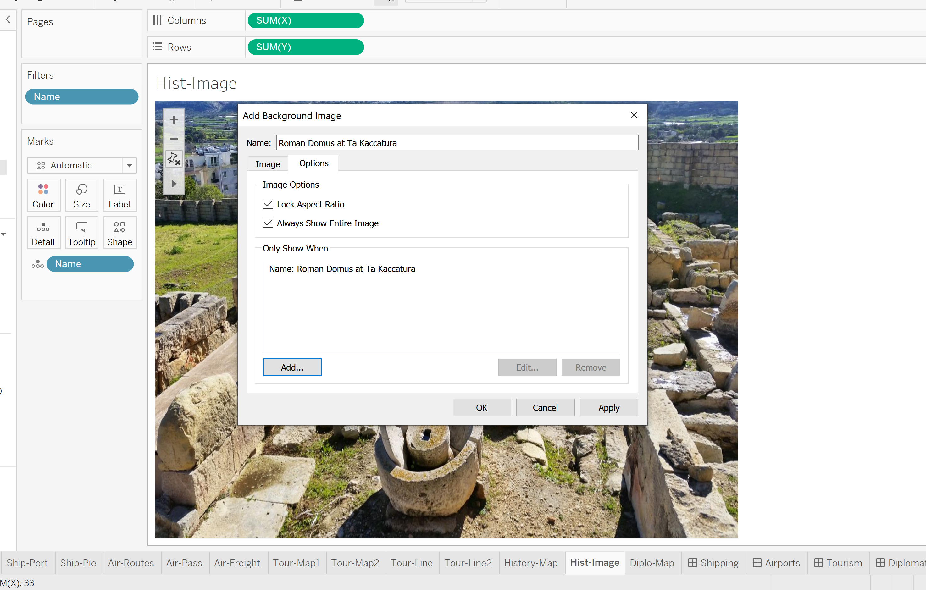
Dynamic Image Fails
While I did get the dynamic image to work, it has some issues. First on all, it is next to impossible to scale the image frame on the dashboard, the image just kept glitching out and resetting to a smaller size. After I finally got the size somewhat larger, I noticed some images would be warped or extend off the page. I believe this is because the images I used were not all the same size and I selected the “Always Show Entire Image” option. Maybe correcting that would fix my issues.